Hey there!
Here's my version of the Wildcard profile
The challenge: Redesign the profile screen of Wildcard (Social media platform on Farcaster) by incorporating both dark mode and light mode.

Farhat's Work
I've used app.wildcard.lol before and one of my favourite features is the instant profile creation it offers. I spent a couple of hours just browsing through the app to understand the challenge I was supposed to solve. (No, I don't call it scrolling, it was research 🫣)
Analysing the existing layout and identifying areas for improvement led to these findings.
Lack of inclusivity of financial stats in the profile
Information overload on the main profile view
Lack of clear hierarchy in the layout
Inconsistent spacing between elements
Minor readability constraints
Before exploring the solutions, I recreated the existing design in Figma - typography, colours, iconography and more - to find out my playing ground.
The fonts used were: Bungee and SF Pro Display
Then began the iterative journey of f* around find out. It's just like A/B testing, but for the designer herself 🧚🏽♀️.
Here are a few concepts made along the way -

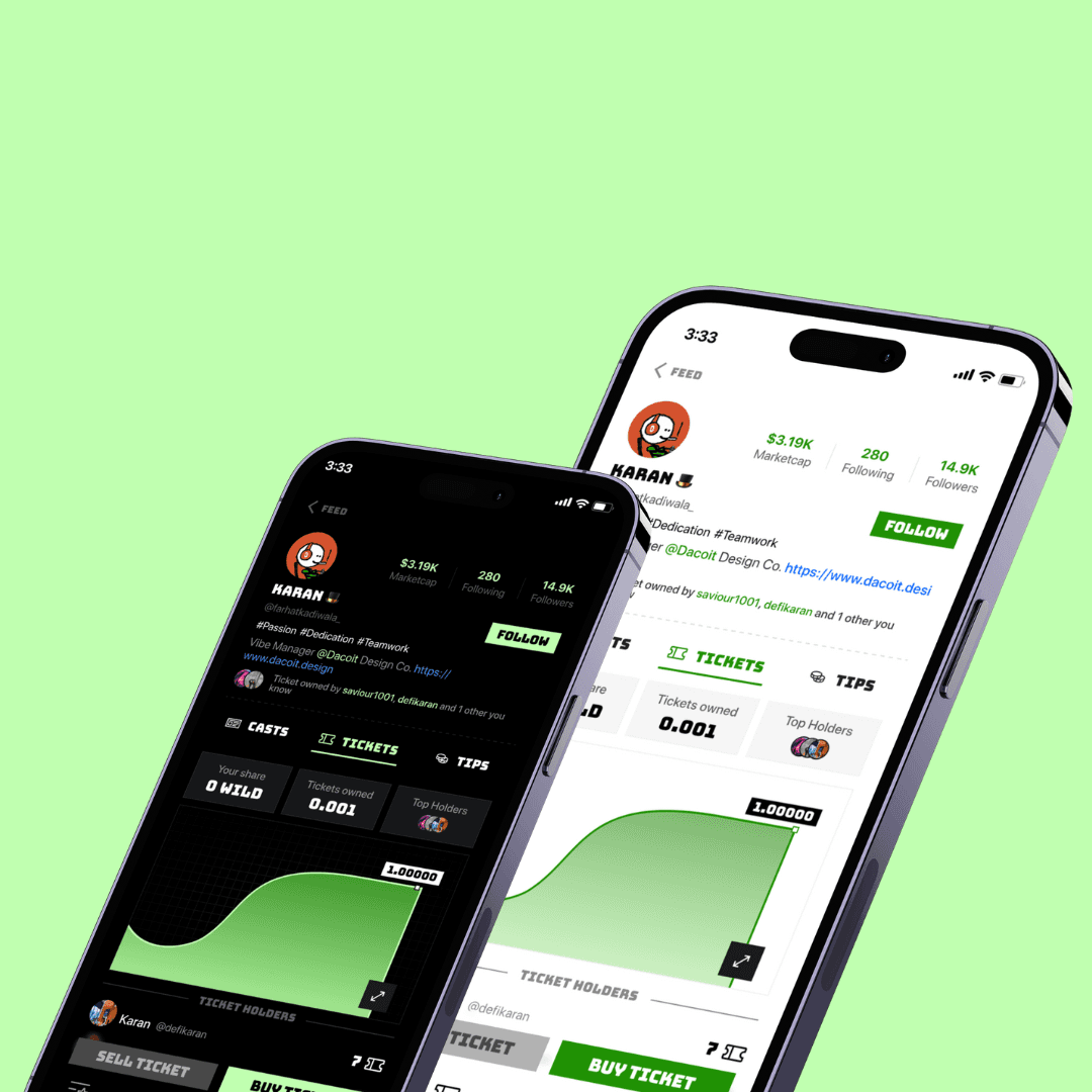
In traditional social media, users often look at follower counts as a measure of influence and/or popularity. By placing market cap in the same visual hierarchy, we're encouraging users to think of it as an equally important indicator of a profile's significance.

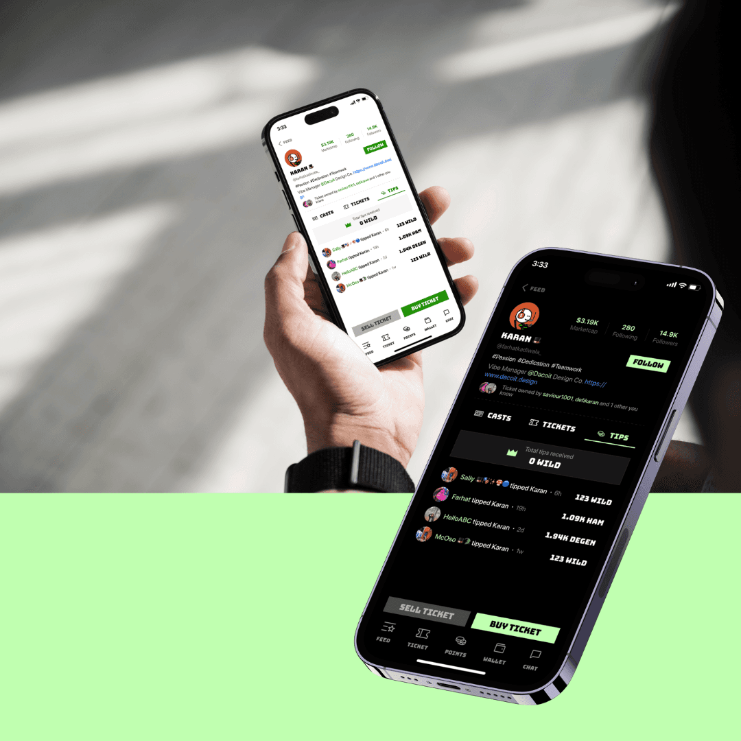
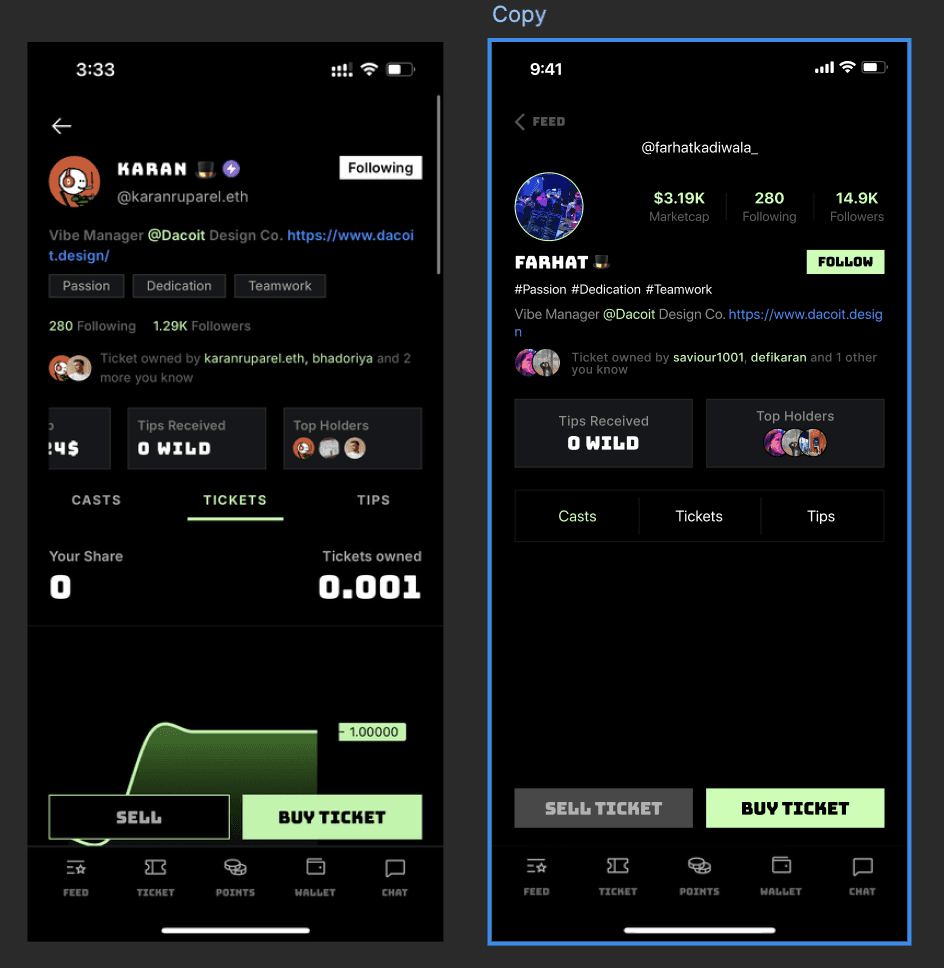
I streamlined the main profile view by moving Top Holders and Tips Received into their respective tabs. This helped reduce the amount of information that would always be present on the screen.
I also refined the information hierarchy. The new layout presents the user's photo, market cap, and follower stats prominently at the top, followed by name, username, and a strategically placed follow button. Profile tags and bio come next, providing instant context about the individual.
Here's the low fidelity wireframe of the layout I propose - Figma link

I standardised the spacing between elements to create a more cohesive and polished look. This improved overall readability and gave the design a more professional feel.
To enhance user interaction, I added subtle animations to the follow button and tab switching. These micro-interactions provide visual feedback and make the interface more engaging.
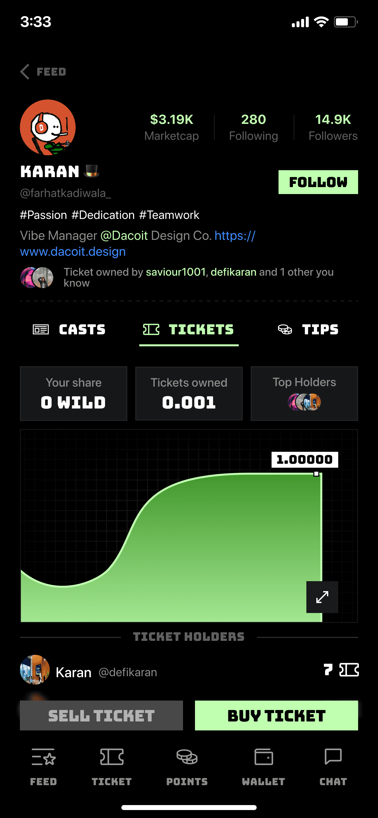

I also used Ticket icon instead of the letters to represent tickets.
And added icons to the tabs for more visual clarification.
I conducted A/B testing with two users (I've got helpful friends 😎), who reported that the new design felt cleaner and more intuitive to navigate.
Throughout this process, I focused on balancing aesthetics with functionality, ensuring that the redesign not only looked better but also improved the user experience.
Here's the proposed design - Figma link